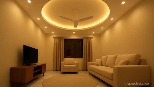
POP Colour Design Ideas and Colour Combinations
- 15 designs
- By style
- Updated 07 Oct 2026
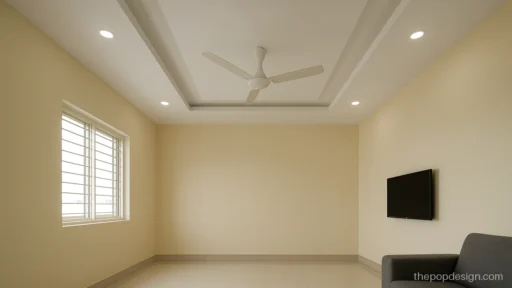
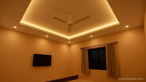
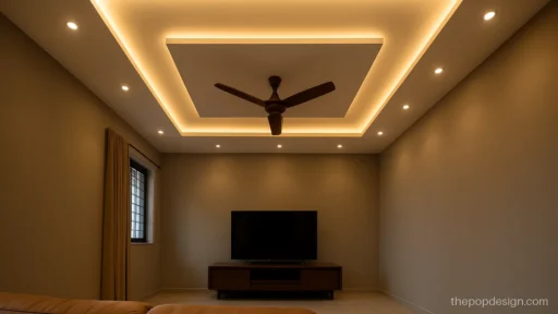
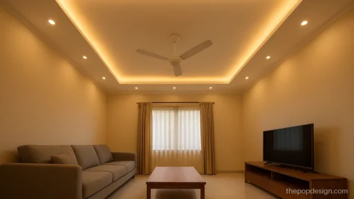
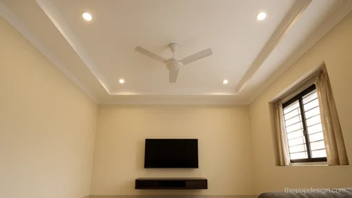
A POP colour design can change a room more than an extra layer of POP. One soft colour in the right band makes a white ceiling look planned and gives depth without extra drop.
Each picture below gives the colour pair and the paint finish to ask for. Most ceilings look best in matte emulsion, because it hides small waves in the punning. Satin emulsion suits small bands and wood-tone accents. If you want a layered shape first, see the plus minus POP design gallery.
POP Design Colour Combination Ideas
Two colours are enough for almost any room. Keep the lighter colour on the bigger area and the deeper one on the step or band.
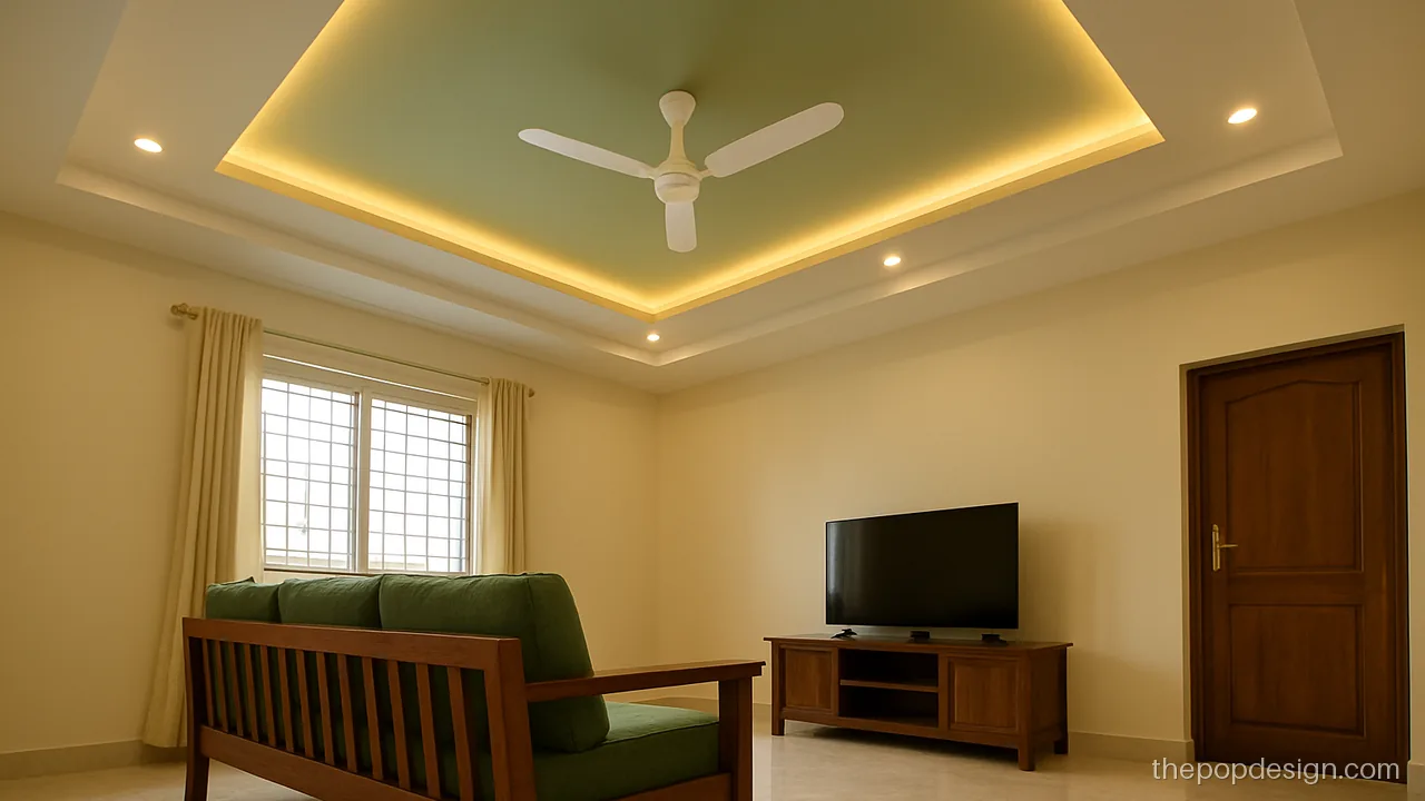
Ivory on the main ceiling with a sage green inner band feels fresh and calm. The pair suits halls with wooden furniture. Finish: matte emulsion.
Contractor tip: Paint sage only on the inner band. Mask the edges with tape so the colour line stays sharp.
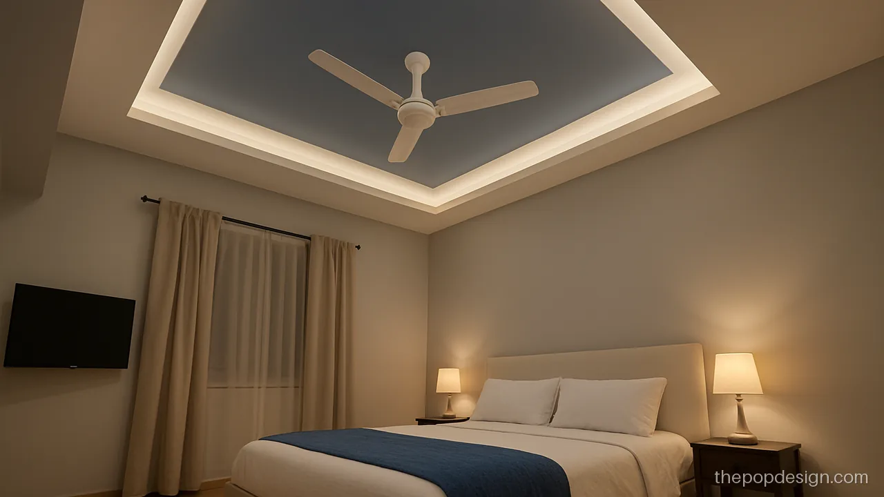
Dusty blue on the upper step makes the cove light look cooler and cleaner. White below keeps the room bright. Finish: matte.
Contractor tip: Prime both colours with the same primer. Ask for two coats of blue, rolled in one direction.
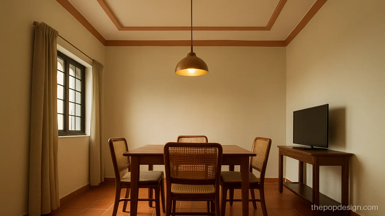
A thin terracotta border warms up a cream ceiling over the dining table. Use it where wood and brass are already in the room. Finish: satin on the border.
Contractor tip: Keep the terracotta border to 6 inches only. Use satin there and matte on the cream.
Plus Minus POP Design with Colour
Plus minus means raised and recessed boxes. Colour the recessed boxes and leave the raised ones white, so the pattern reads clearly from below.
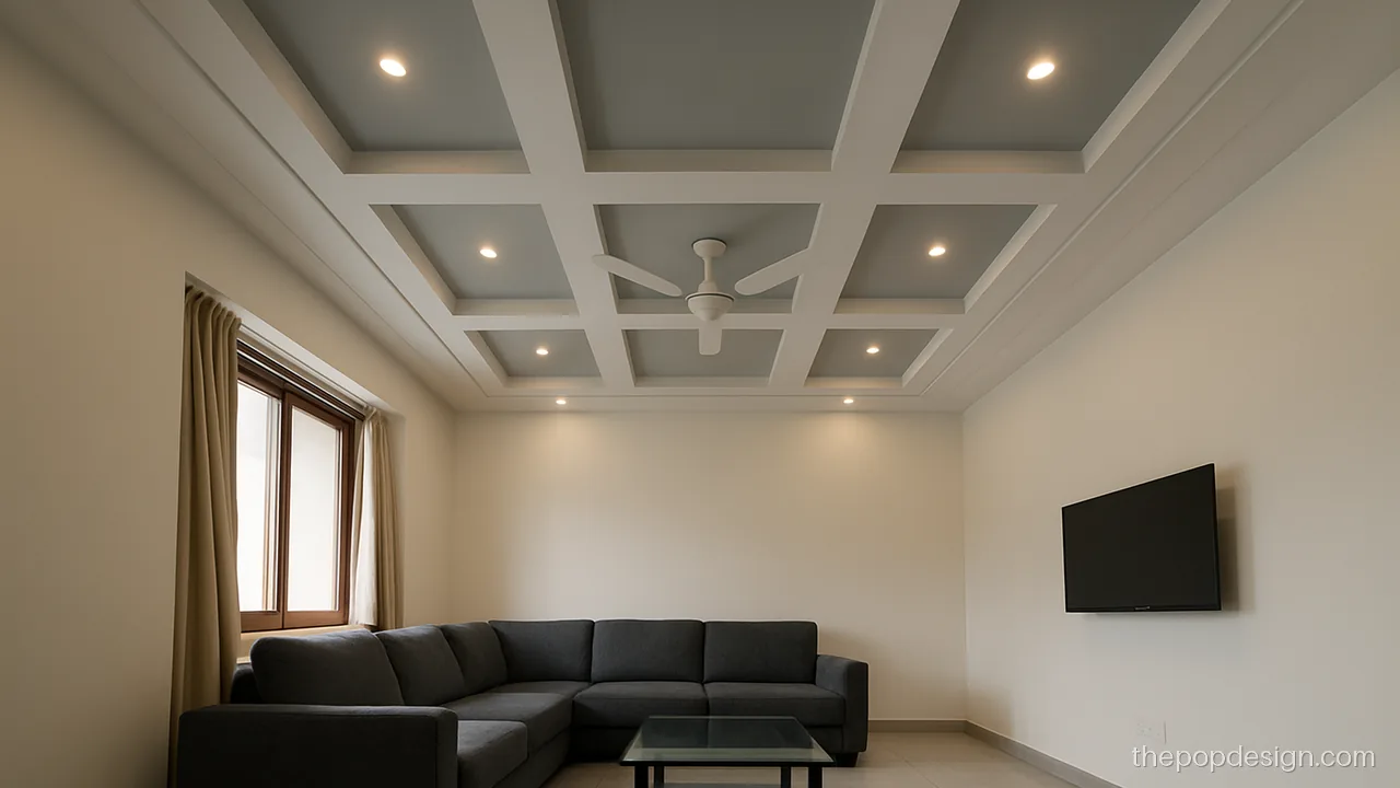
Grey recesses and white raised boxes give clean depth even in daylight. This is a safe plus minus pop design colour combination for big halls.
Contractor tip: Paint recesses before fixing spot lights. Check each box corner is sharp before colour goes on.
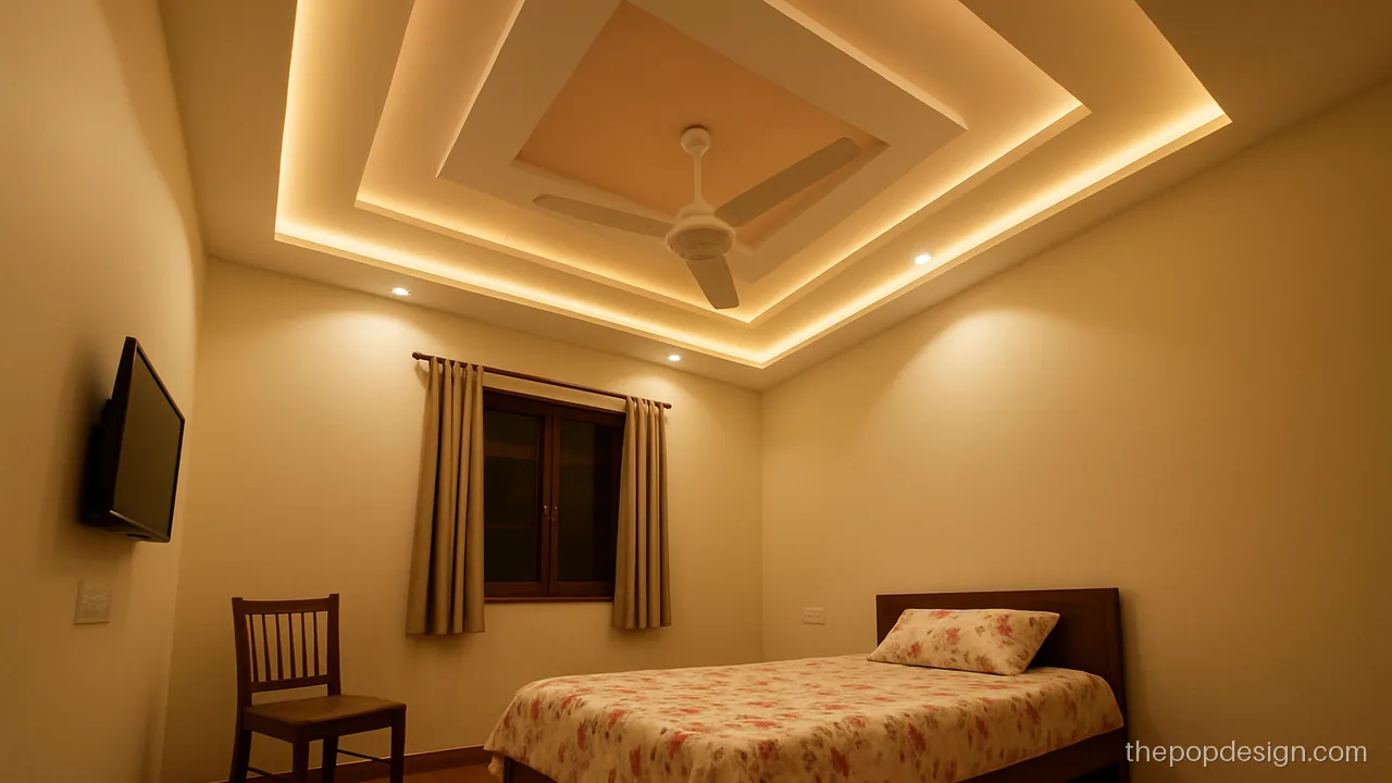
Soft peach inside the minus boxes gives a warm glow under warm light. It suits girls rooms and guest rooms.
Contractor tip: Keep box depth at 2 to 3 inches. Paint peach with a small roller to avoid splashes on white.
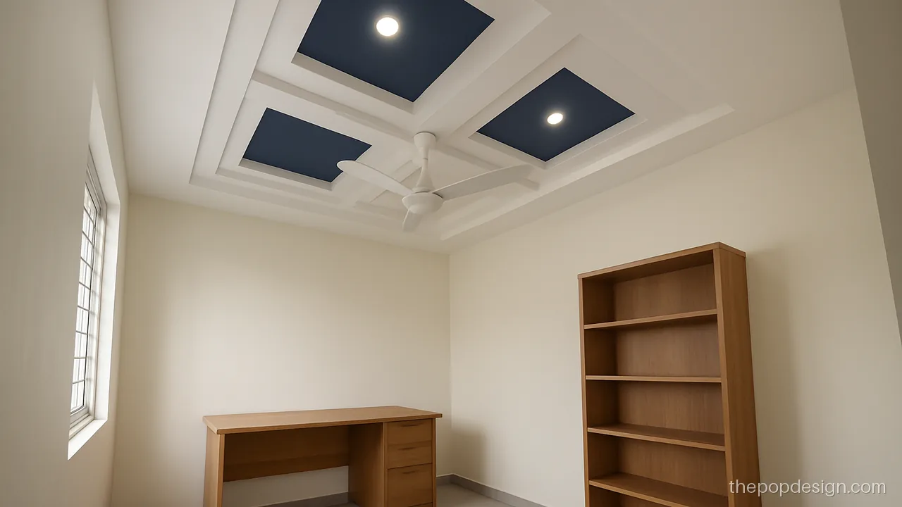
Navy is bold, so it goes only in two small boxes. The rest stays white so the study does not feel dark.
Contractor tip: Use navy only in two boxes. Ask for one extra coat because deep colours patch easily.
Hall POP Design Colour Ideas
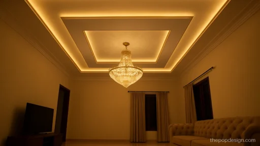
Halls get daylight and night light, so test colour at both times. A small sample patch on the ceiling tells you more than a card.
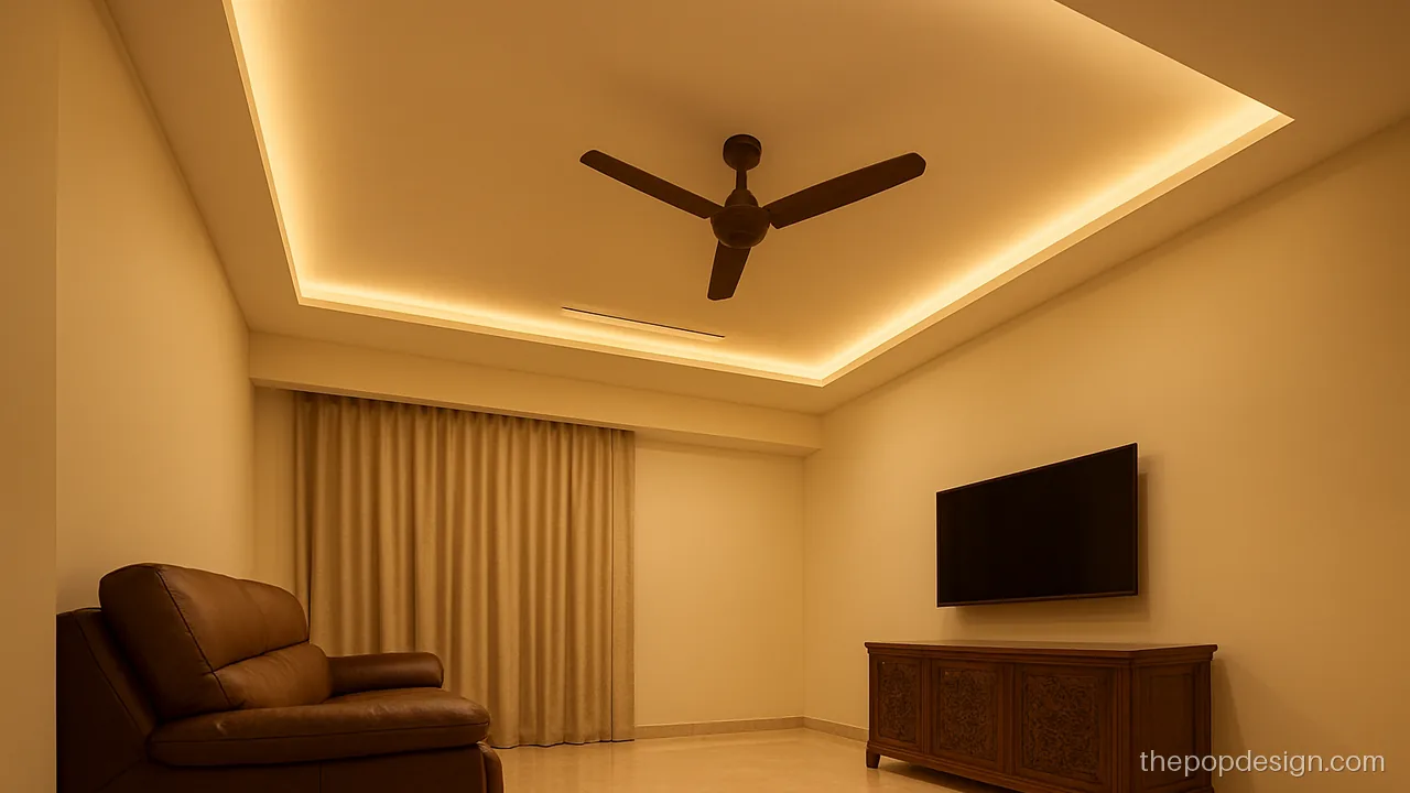
Warm beige and a wood-tone strip suit halls with brown furniture. The beige hides dust better than pure white.
Contractor tip: Use satin on the wood-tone strip and matte beige elsewhere. Fix the strip after paint dries.
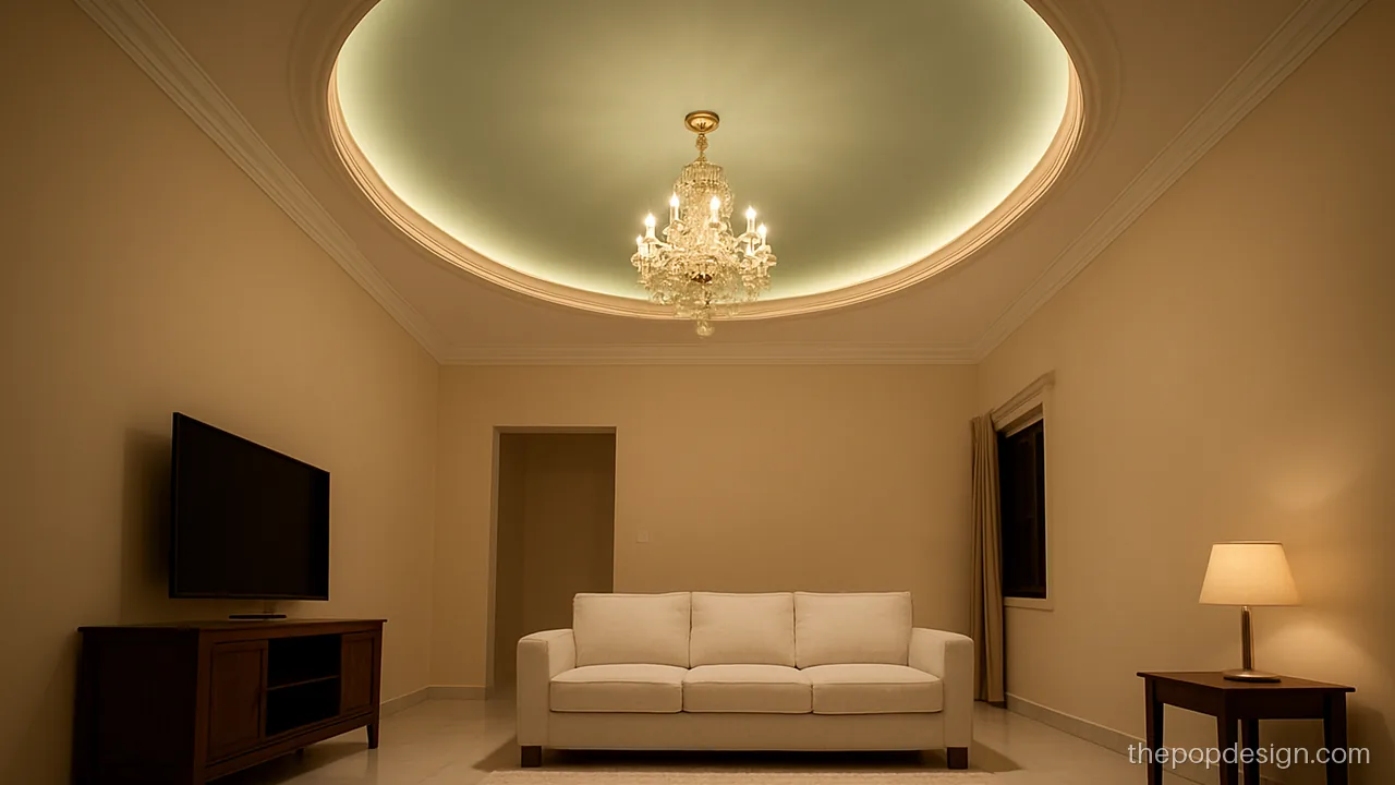
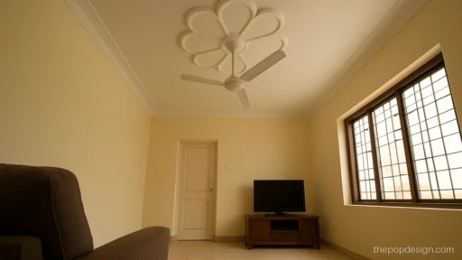
A mint green oval makes a square hall feel open and cool in summer. White around it keeps it light.
Contractor tip: Paint mint inside the oval only. Keep the jhumar hook in the slab at the exact oval centre.
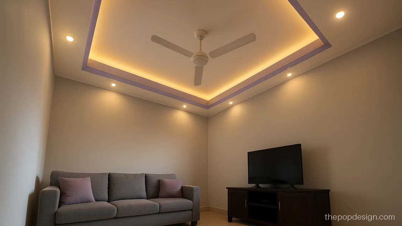
Purple looks best as a soft lilac, not a dark shade. Use it on one band only and keep white in the centre.
Contractor tip: Pick a light lilac with grey in it. Test a 2 foot patch on the ceiling under both lights.
Bedroom POP Colour Design
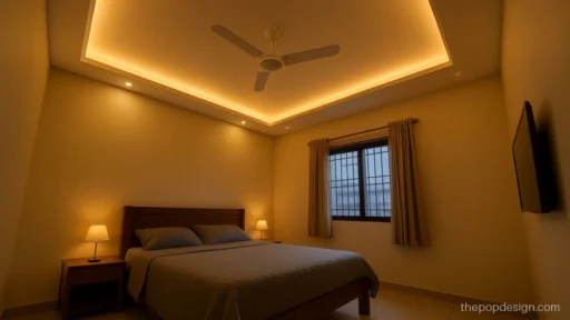
In bedrooms the ceiling is seen lying down, so colour matters more. Soft, low-sheen colours help you rest.
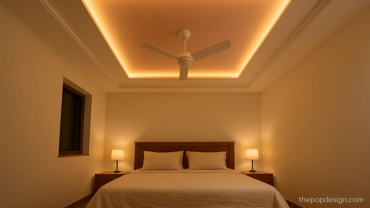
Blush pink inside the cove panel gives a warm, rosy glow at night. It works for couple rooms and girls rooms.
Contractor tip: Use matte blush pink inside the panel. Keep warm white LED so the pink does not look orange.
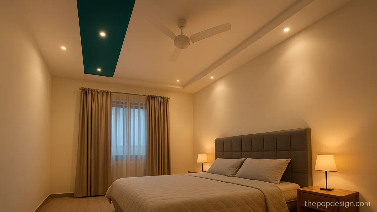
A teal strip running over the bed draws the eye and frames the headboard. The rest of the ceiling stays white.
Contractor tip: Align the teal strip with the headboard centre. Use satin teal and matte white.
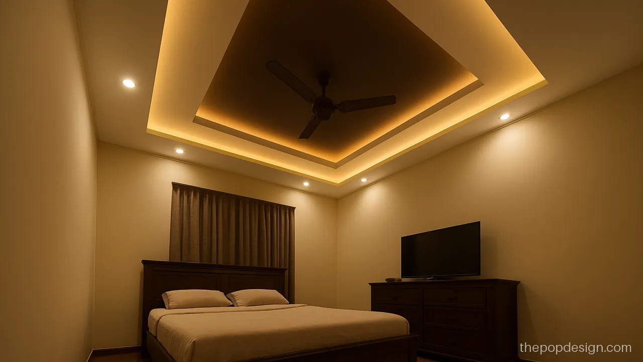
Coffee brown on the upper step and cream below gives a calm, rich look. It suits rooms with dark wood furniture.
Contractor tip: Paint brown only after the cove LED channel is fixed. Touch up edges with a small brush.
White, Grey and Bold Accent Ceilings
White is still the best colour for POP design in most Indian homes. Grey suits modern rooms, and one bold accent works if you keep it small.
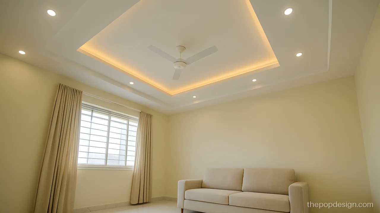
All white reflects the most light and suits any wall colour. It is the easiest to repaint later.
Contractor tip: Ask for two coats of matte white over primer. Check under a torch for waves before final coat.
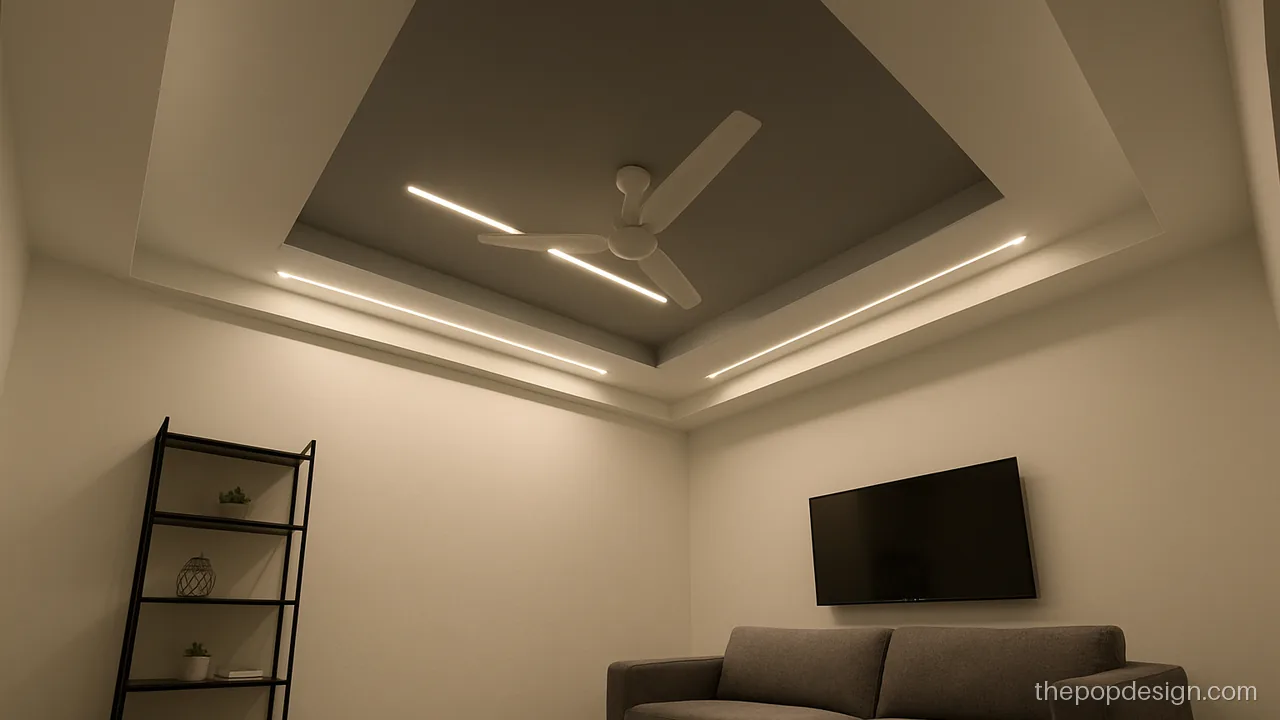
Two shades of grey give depth without any bright colour. Pair with white walls and black or brass fittings.
Contractor tip: Use a light grey on the main area and a mid grey on the step. Keep both in matte.
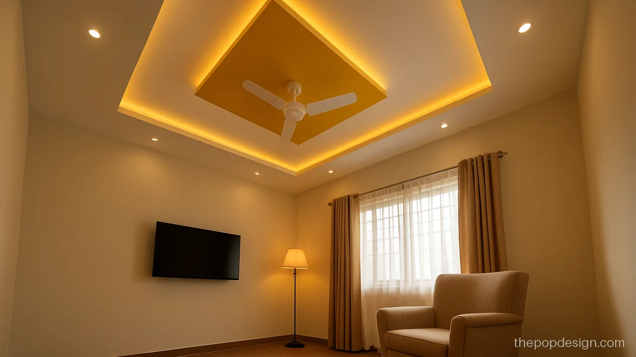
One mustard box over a reading corner adds fun without taking over. Keep everything else white.
Contractor tip: Use mustard only in one small box. Paint it last, after all white coats are dry.
Best Colour for POP Design: Quick Guide
| Room | Colour pair | Finish |
|---|---|---|
| Hall | Ivory + sage, white + light grey, beige + wood tone | Matte |
| Bedroom | White + blush pink, cream + coffee brown, white + dusty blue | Matte |
| Study | White + navy (small boxes only) | Satin on accent |
| Dining | Cream + terracotta | Satin on border |
Low ceilings need light colours. Dark colour on a low ceiling makes the room feel smaller. Warm light makes colours look richer; cool light makes them look flatter. For a simple base layout to colour, see simple POP design.
POP Colour Design Painting: What to Tell the Painter
- Wait until the POP is fully dry, about a week or more.
- Sand lightly and fill any hairline cracks first.
- Apply one coat of primer on all POP.
- Tape every colour line before rolling.
- Do two coats of each colour, light colour first.
- Fix cove strips and profile lights only after paint dries.
Roof pop colour design painting costs depend on area, number of colours, and how many edges need masking. More colours and more lines take more labour. Read the POP design price guide for how this adds up.
POP design questions
What is the best colour for POP design in a hall?
White, ivory and light grey are safest. Add one soft colour like sage, beige or mint on a band or recess. Avoid dark colours on the whole ceiling.
Which plus minus POP design colour combination looks good?
Colour the recessed boxes and keep the raised boxes white. Light grey with white, peach with white, and beige with white are easy picks. See more on the plus minus POP design page.
Should ceiling POP design colour be matte or satin?
Use matte emulsion on large ceiling areas, because it hides small waves. Satin suits small accent bands and wood-tone strips. Gloss is not good on ceilings.
Can I use a simple POP design colour scheme in a small room?
Yes. Keep the whole ceiling white or very light and add colour only on a thin border. This keeps the room bright and open.
Why do coloured POP ceilings show patches?
Usually the POP was not fully dry or primer was skipped. Deep colours also need an extra coat. Wait for full drying and roll in one direction.
Do purple and pink suit a POP ceiling?
They can, in soft shades like lilac and blush. Use them in one band or panel only. For more styles, see modern POP design.